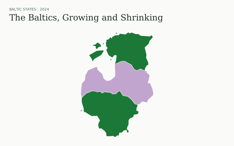
The Baltics, Growing and Shrinking
Compare population change from 1 January 2020 to 1 January 2024, or switch to either year.
3 places
Browse and interact with real maps made with Mapfetti. See what’s possible, get inspired, and make one your own.
Explore Labs · experimental maps →
77 examples
Compare population change from 1 January 2020 to 1 January 2024, or switch to either year.
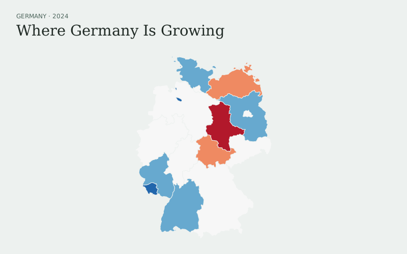
Compare population change from 1 January 2020 to 1 January 2024, or switch to either year.
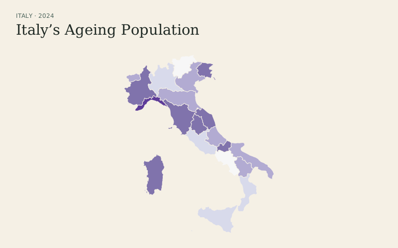
Explore the share aged 65+ and median age across Italy’s regions on 1 January 2024.
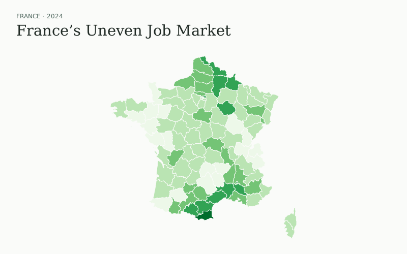
Compare unemployment in 2015 and 2024, plus youth unemployment, across 96 metropolitan departments.
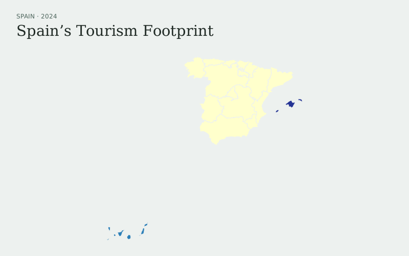
Compare 2024 overnight stays per resident, with domestic and international visitor selectors.
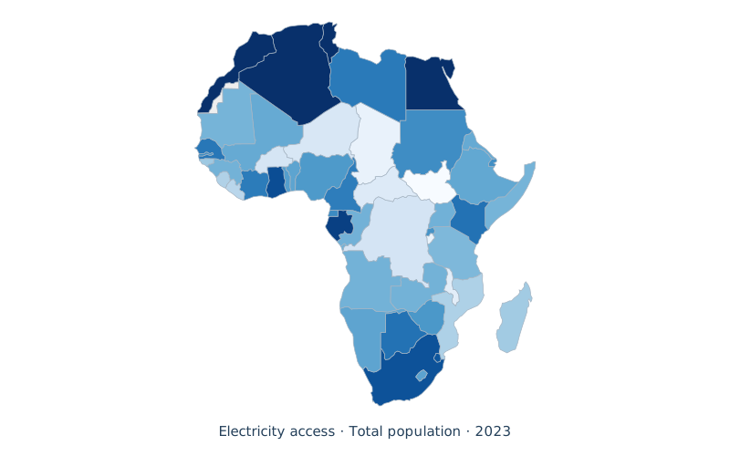
Compare rural and urban electricity access together with a 3 × 3 bivariate choropleth.
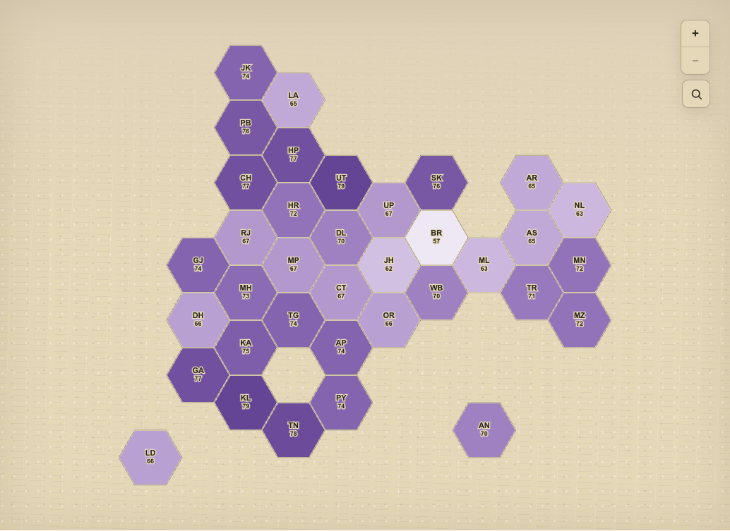
Give every Indian state and union territory equal space while comparing overall, health, and education scores.
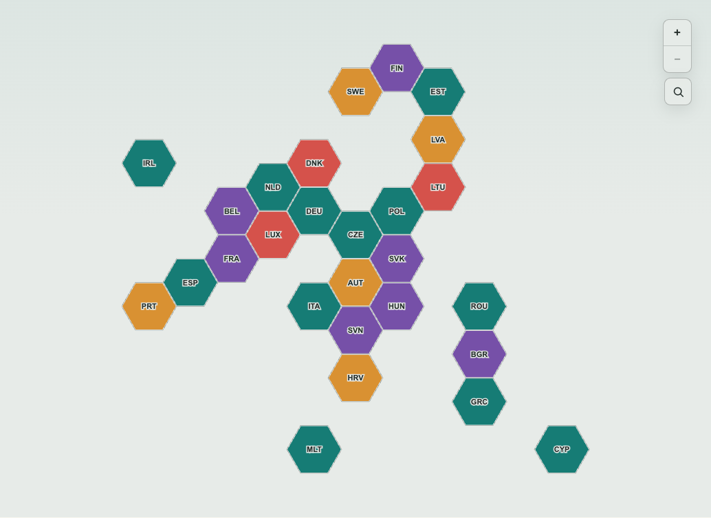
Explore the largest electricity-source group in each EU country, then switch to generation shares.
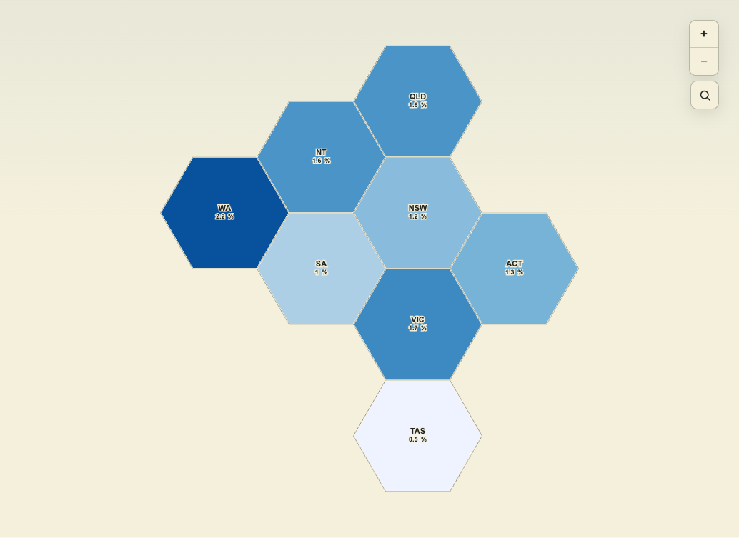
Compare population growth and its drivers across Australia’s eight main states and territories.
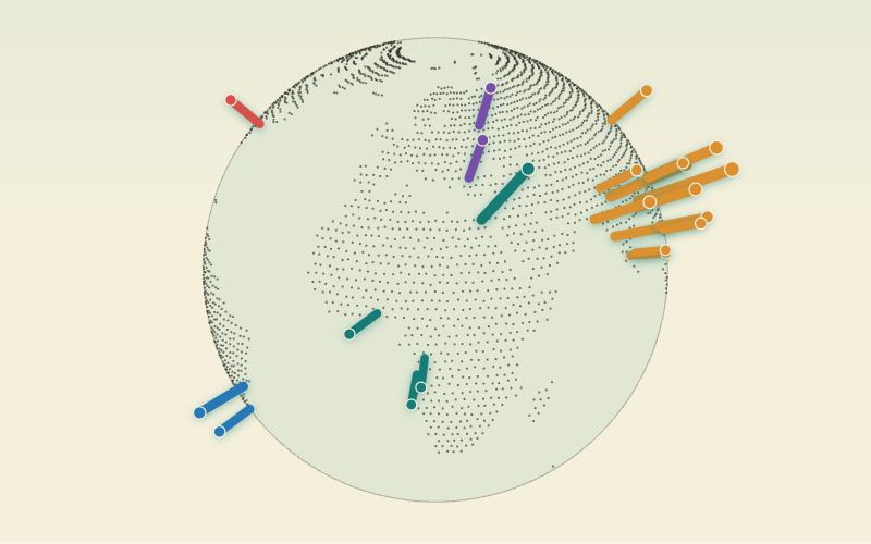
Rotate a dotted 3D globe and compare the world’s largest cities with extrusion height driven by population.
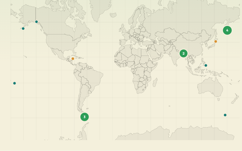
Compare all magnitude 7+ earthquakes recorded in 2025 with circle area driven by relative energy.
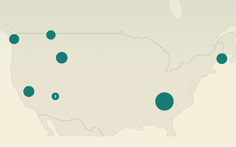
Compare 2025 recreation visits while opening photos, descriptions, and official park links.
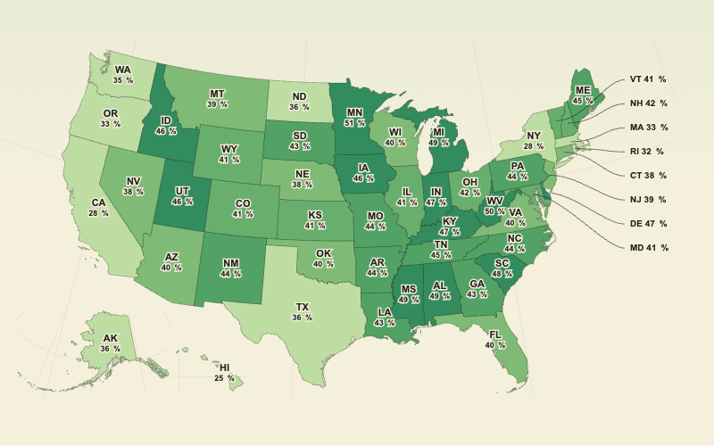
Use a state choropleth to reveal where homeownership among adults under 35 is higher or lower.
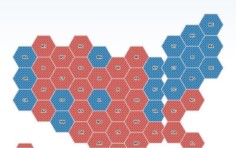
Distinguish the statewide 2024 presidential popular-vote winner with party colors and a subtle diagonal texture.
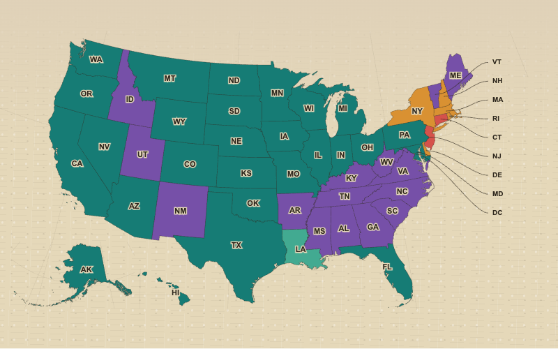
Compare the leading self-reported European ancestry group across every U.S. state and the District of Columbia.
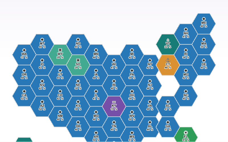
Compare each state’s fastest-growing occupation with category icons and projected percentage growth.
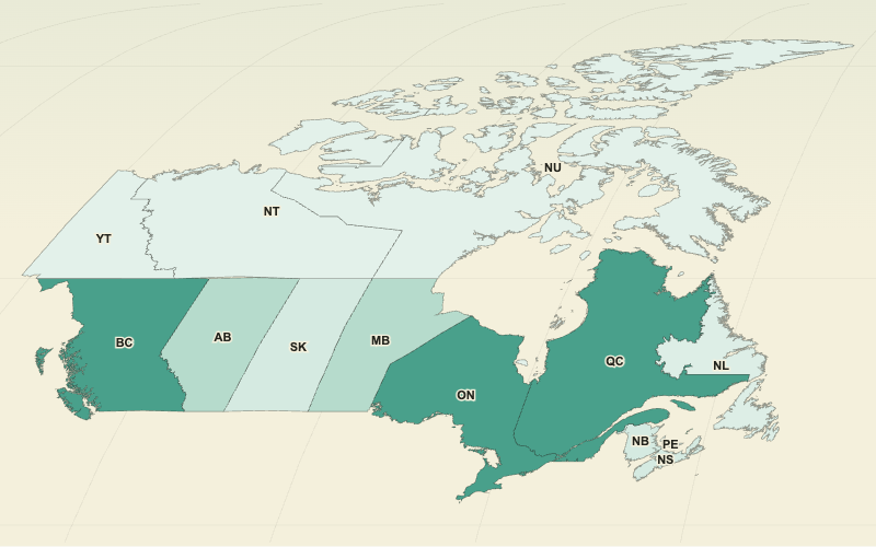
Switch among the 2011, 2016, and 2021 censuses for Canada’s provinces and territories.
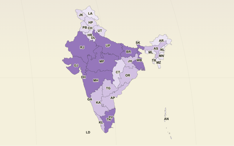
Switch among 2021, 2026, and 2031 state and union territory population projections.
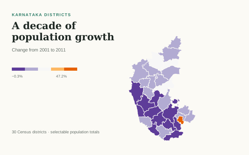
Compare population growth across Karnataka’s 30 Census districts, or switch to either Census population total.
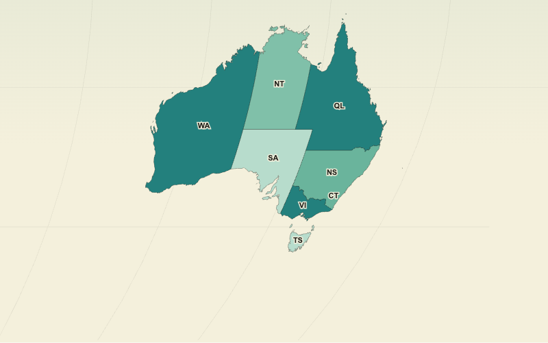
Compare population, annual change, and growth rate across Australia’s states and territories.
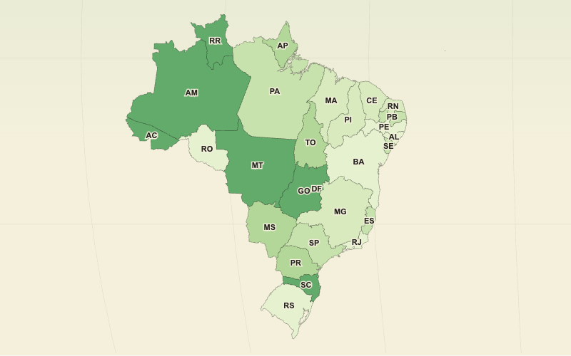
Map percent population change between the 2010 and 2022 censuses across Brazil’s federative units.
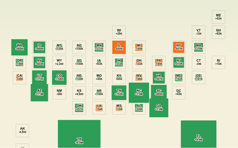
Compare projected growth and decline with squares sized by the magnitude of population change.
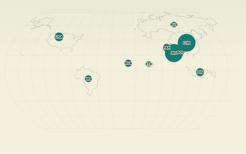
Focus on ten countries so population differences remain clear without crowding the world map.
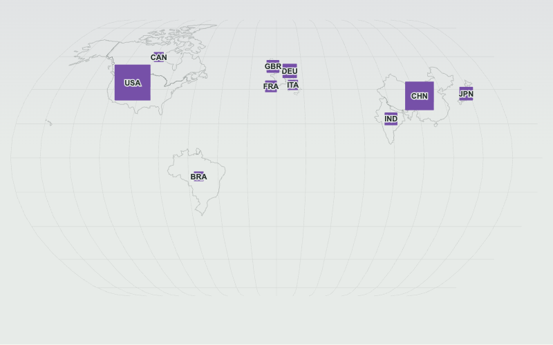
Compare the ten largest national economies with square area driven by current-dollar GDP.
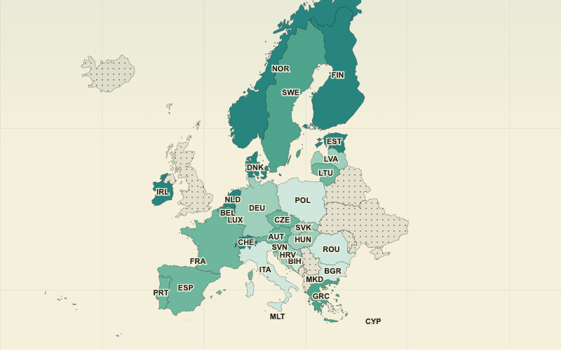
Compare recent AI-tool adoption across European countries with a clear sequential color scale.
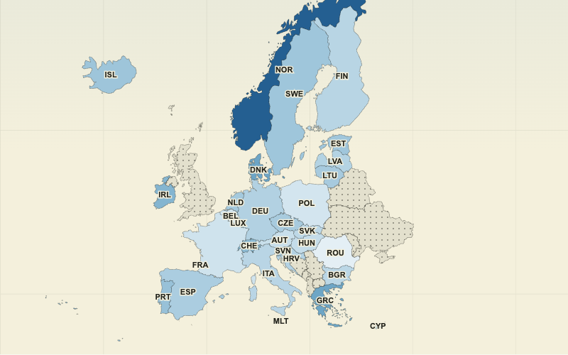
Use a diverging map to distinguish government deficits from budget surpluses.
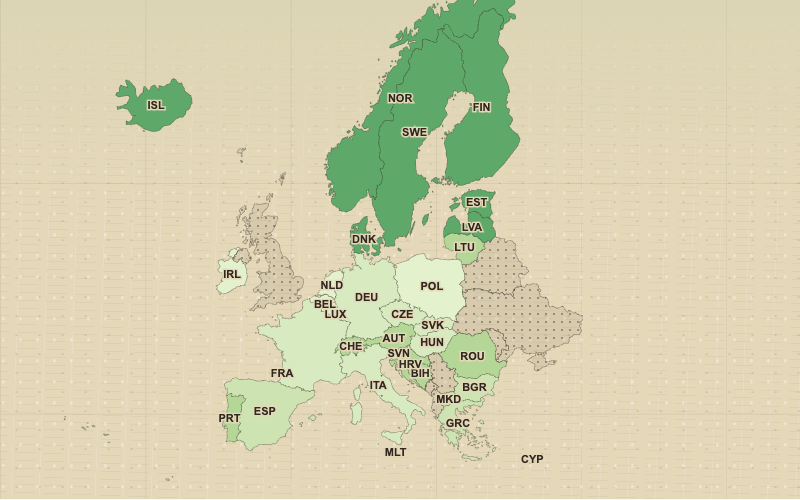
Compare renewable energy’s share of final consumption across 34 European countries.
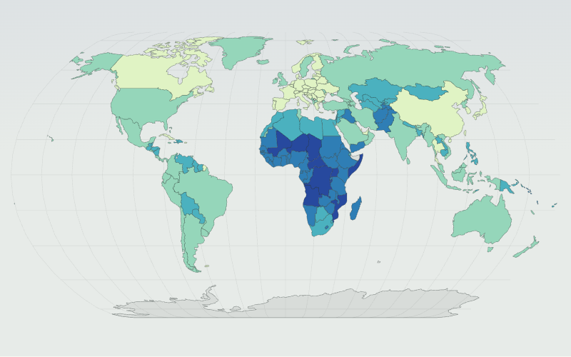
Compare the share of people under age 18 across 172 countries using meaningful 20%, 30%, 40%, and 50% class breaks.
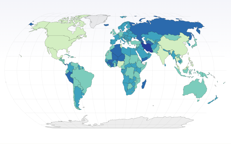
Compare legally mandated paid annual leave and public holidays across countries, with the 30-day global average as a meaningful class break.
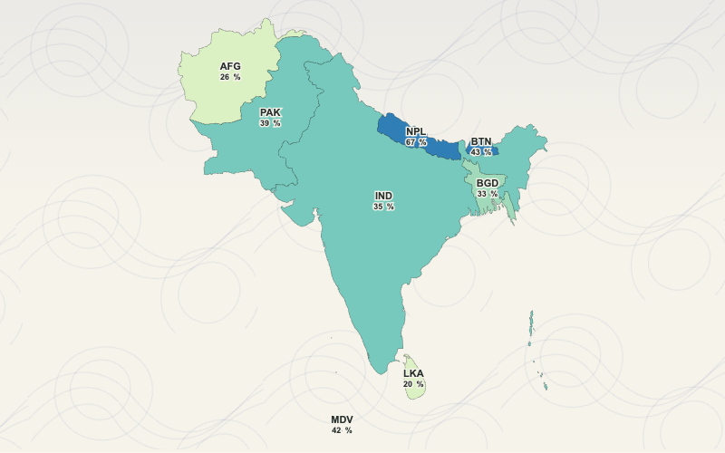
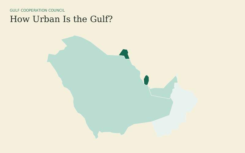
Compare how urbanized the eight SAARC countries were in 2024 using a focused South Asia extent.
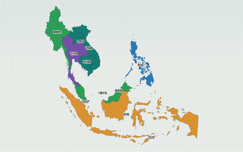
Explore Southeast Asia’s varied colonial histories with a categorical map of today’s eleven countries.
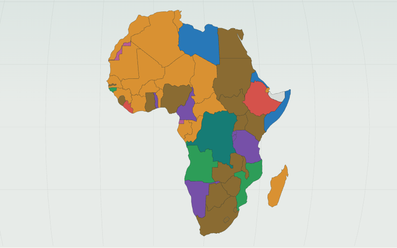
Use a categorical map to explore which colonial authority controlled most of each present-day African country’s territory in 1914.
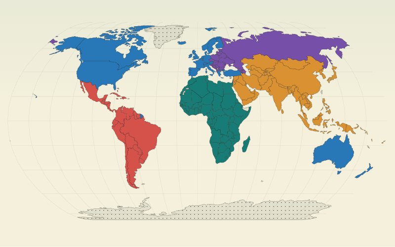
Map the five United Nations electoral groups as distinct categories across the world.
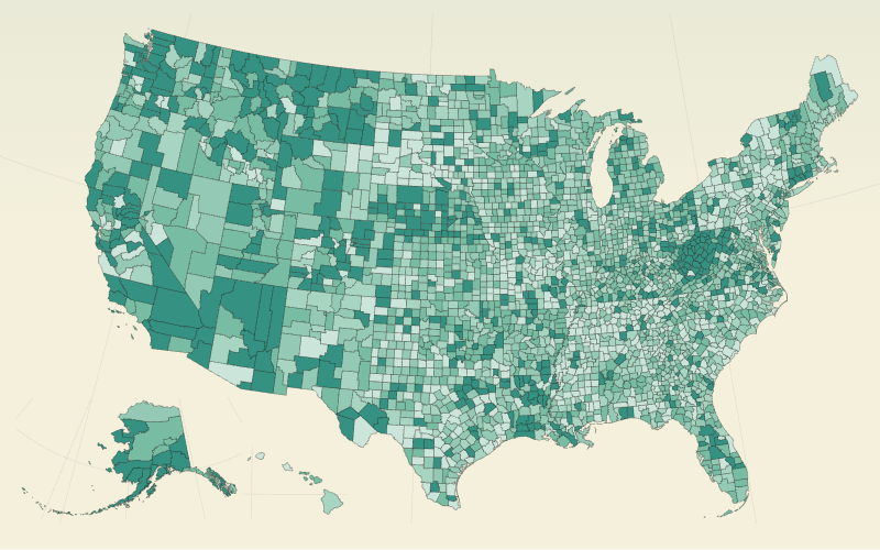
Explore a dense county dataset with a continuous color ramp and a ranked side table.
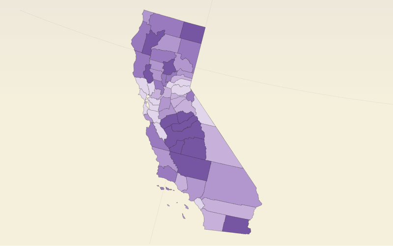
Focus on California’s 58 counties and compare 2023 poverty estimates with a linked side table.
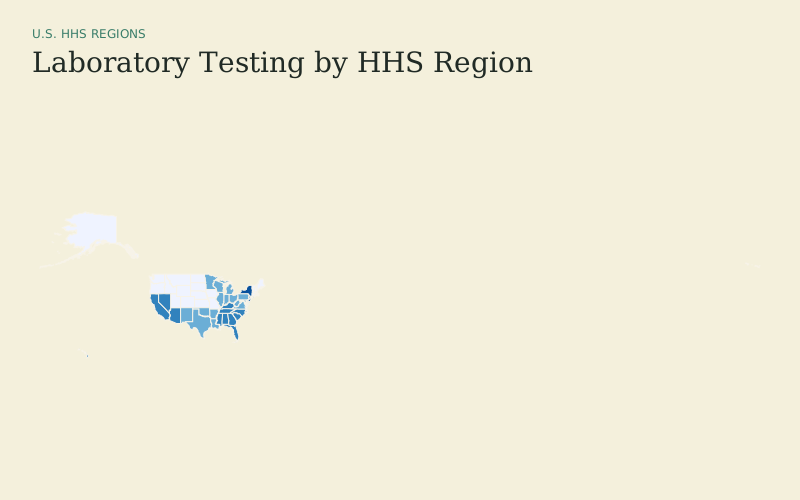
Compare three measures across the ten HHS regions with a viewer-selectable series.
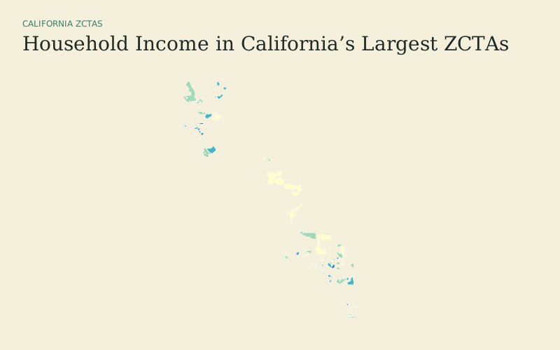
Compare income across a focused set of California Census ZIP Code Tabulation Areas.
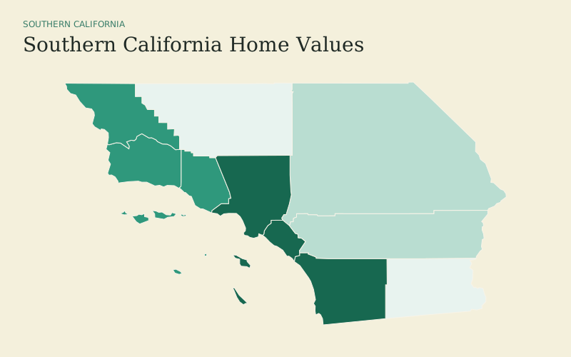
Focus the county viewer on the ten-county Southern California region.
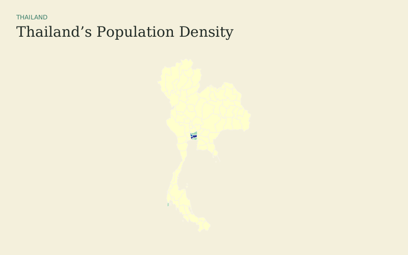
Switch between population density and registered population for Thailand’s 77 provinces.
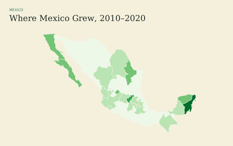
Compare population growth and census totals across Mexico’s federal entities.
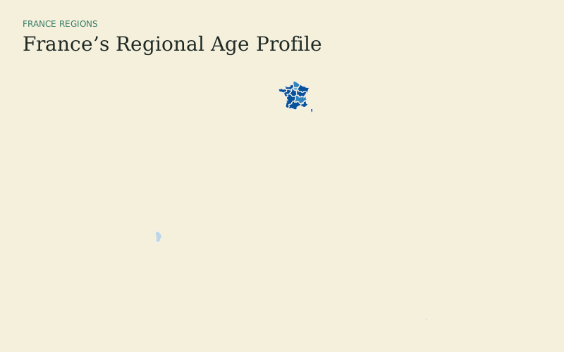
Use France’s 18 official regions, including overseas regions, with two related measures.
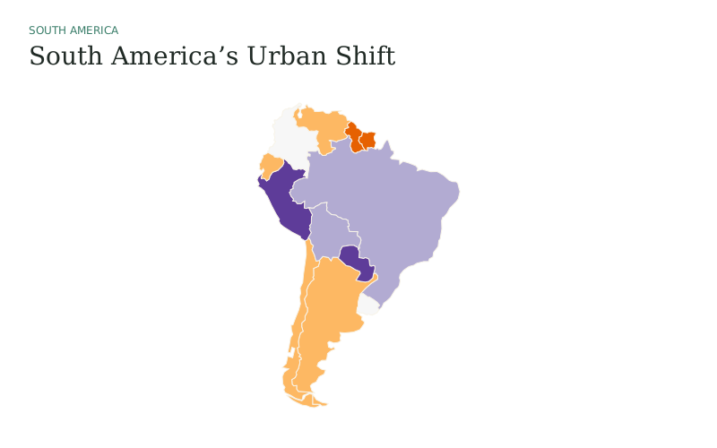
See where urban population share changed most across South America from 2000 to 2024.
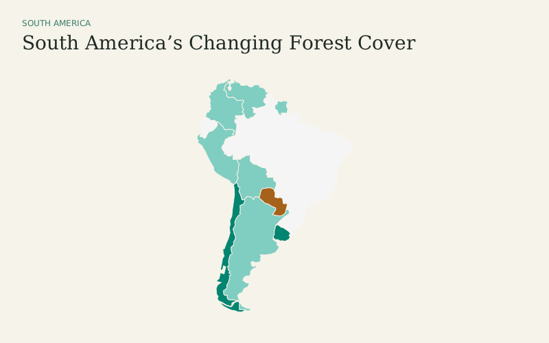
Compare gains and losses in forest area share, then switch to either year.
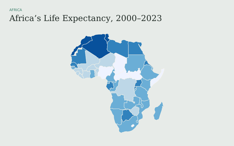
Switch between 2000 and 2023 life expectancy using a shared continental view.
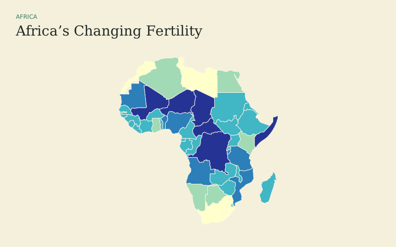
Compare fertility rates in 2000 and 2023 with one viewer-selectable map.
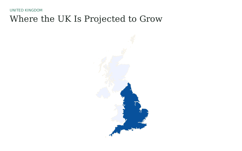
Compare projected population change across the UK’s four constituent countries.
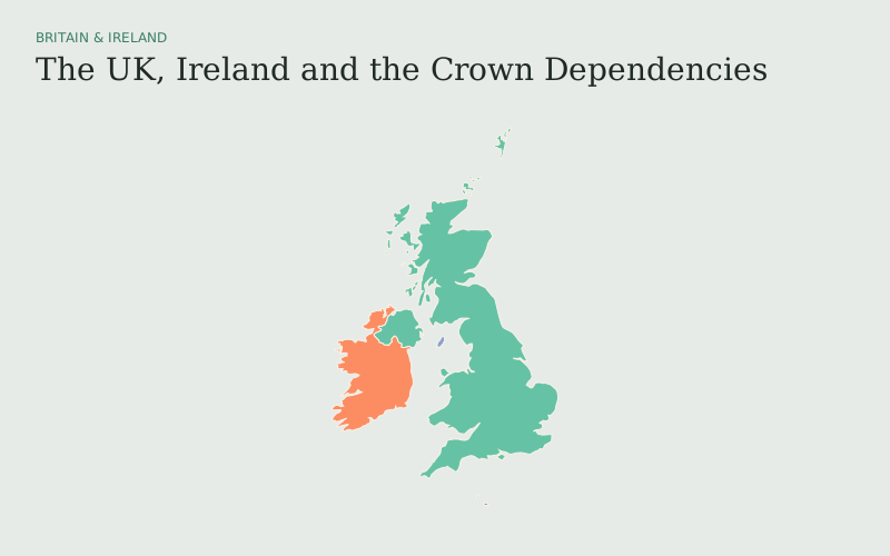
Distinguish the UK, Ireland, and the three Crown Dependencies in one focused regional view.
Scale earthquake points by magnitude while reading current attributes from a public ArcGIS layer.
Explore India’s national parks and wildlife sanctuaries from a live public ArcGIS point layer.
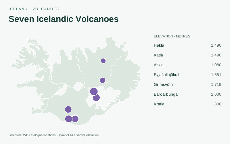
Explore selected volcano locations and compare their catalogued elevations.
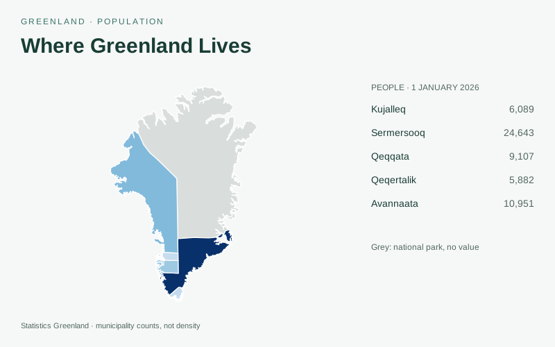
Compare population across Greenland’s five municipalities on 1 January 2025 and 2026.
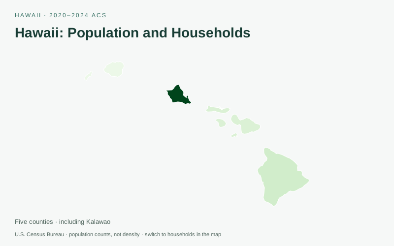
Explore 2020–2024 Census estimates across Hawaii’s five counties.
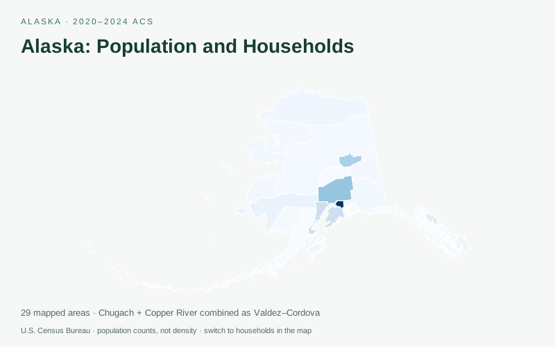
Explore 2020–2024 Census estimates across Alaska’s 29 mapped boroughs and census areas.
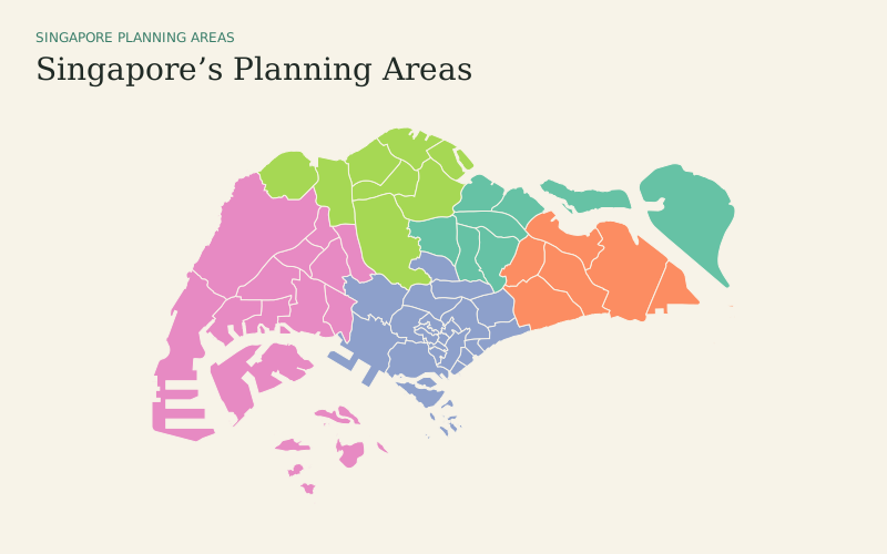
Explore all 55 Singapore planning areas in a focused city-state map.
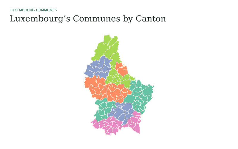
Explore Luxembourg’s 100 communes with official LAU2 identifiers.
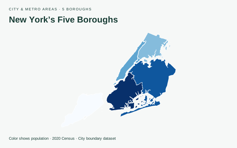
Compare the five boroughs using population counted in the 2020 Census.
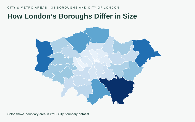
Compare boundary area across 32 boroughs and the City of London.
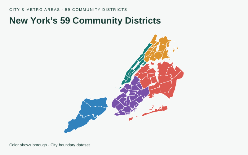
Explore community districts within Manhattan, the Bronx, Brooklyn, Queens, and Staten Island.
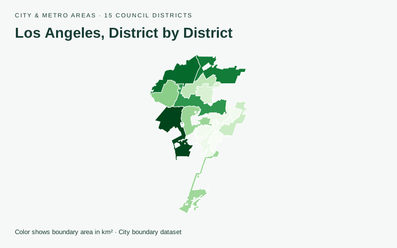
Explore the city’s 15 council districts and compare their approximate boundary areas.
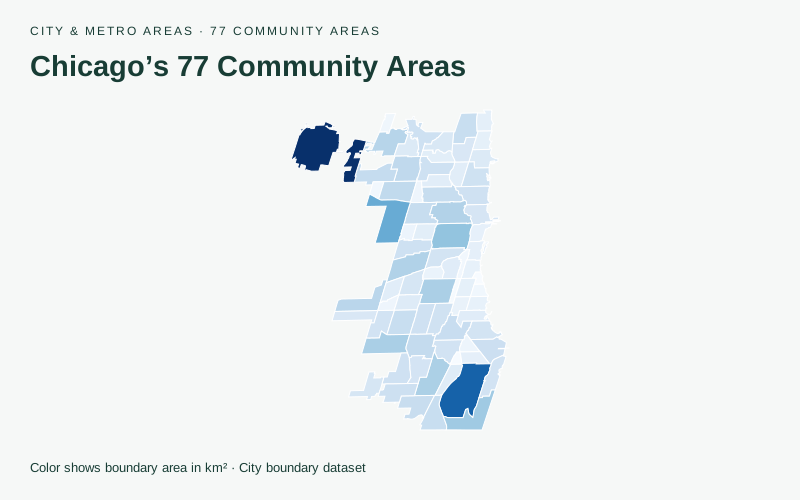
Compare boundary area across 77 community areas. Replace the values to make your own city map.
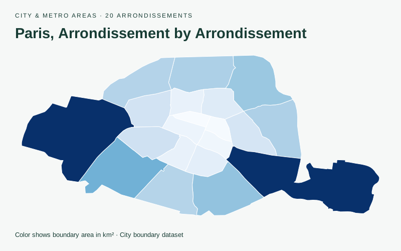
Compare boundary area across 20 arrondissements. Replace the values to make your own city map.
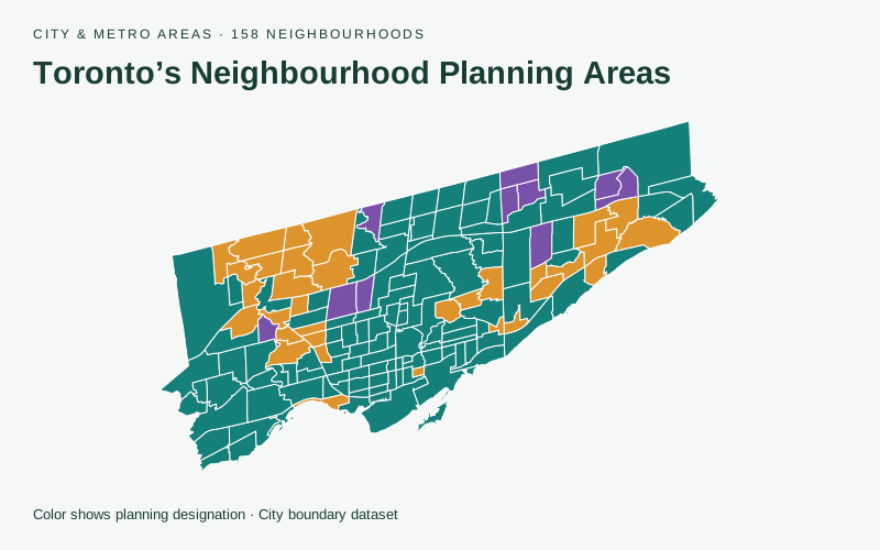
Explore 158 official neighbourhoods and their published planning designations.
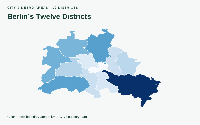
Compare boundary area across 12 districts. Replace the values to make your own city map.
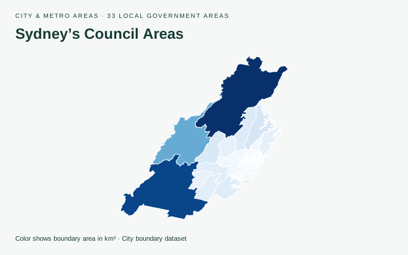
Compare boundary area across 33 local government areas. Replace the values to make your own city map.
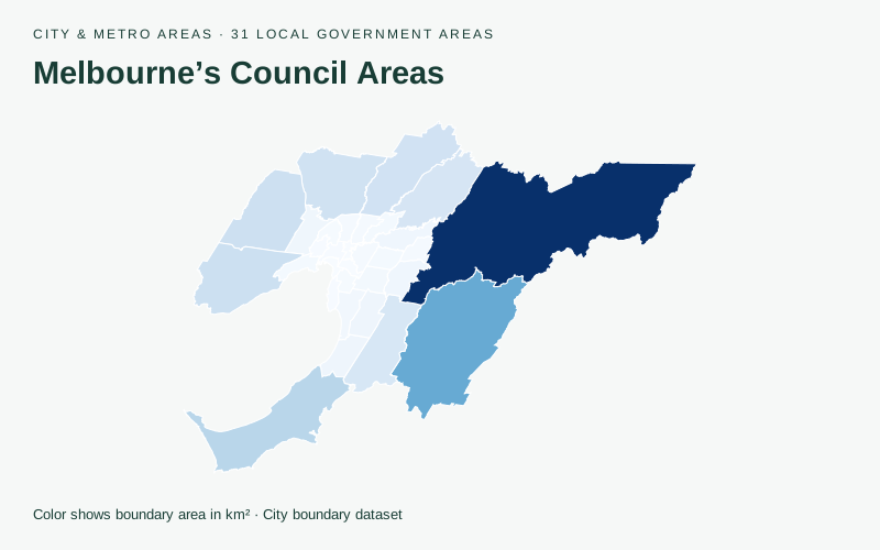
Compare boundary area across 31 local government areas. Replace the values to make your own city map.
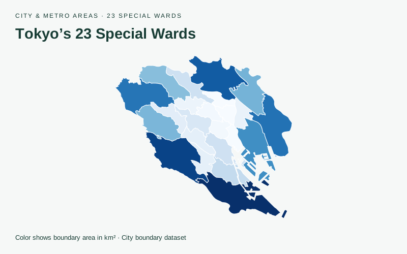
Compare boundary area across 23 special wards. Replace the values to make your own city map.
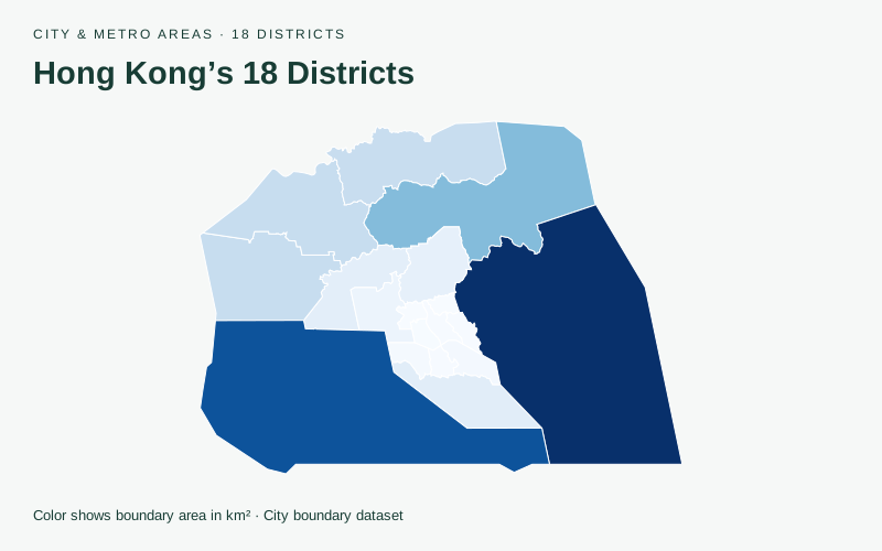
Compare boundary area across 18 districts. Replace the values to make your own city map.
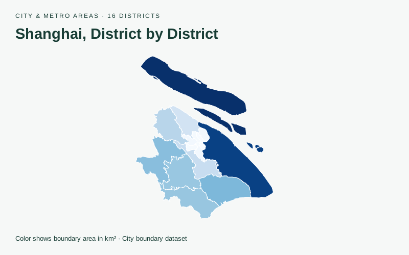
Compare boundary area across 16 districts. Replace the values to make your own city map.
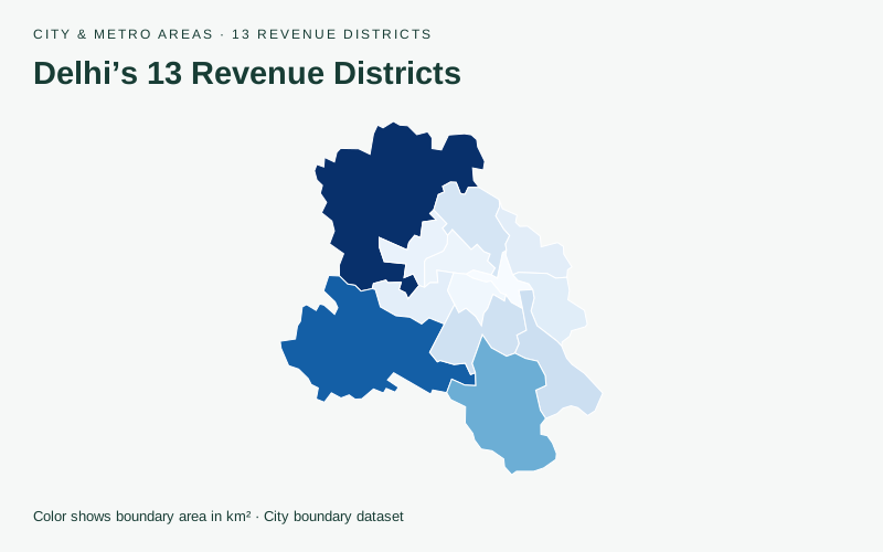
Compare boundary area across 13 revenue districts. Replace the values to make your own city map.
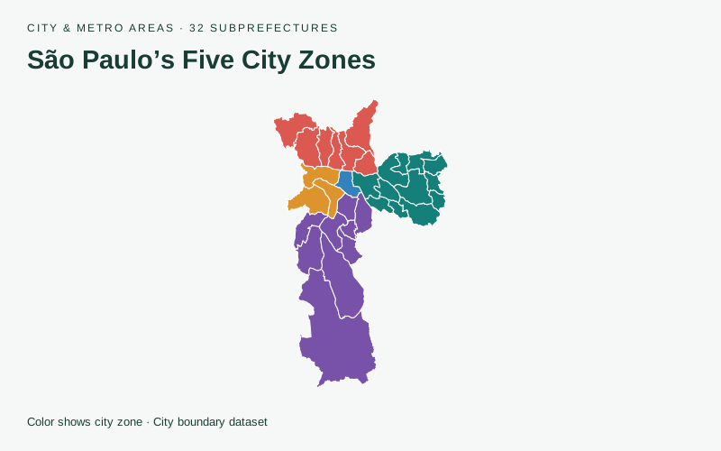
Explore 32 subprefectures grouped by GeoSampa’s five city zones.
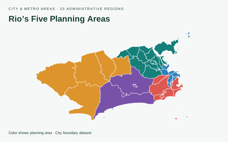
Explore 33 administrative regions grouped by the city’s five planning areas.
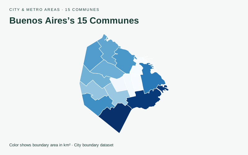
Compare boundary area across 15 communes. Replace the values to make your own city map.
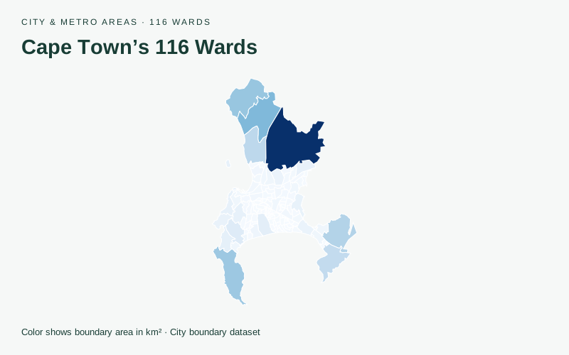
Compare boundary area across 116 wards. Replace the values to make your own city map.
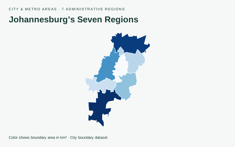
Compare boundary area across 7 administrative regions. Replace the values to make your own city map.
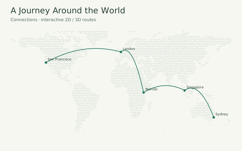
Five illustrative stops. Follow the connections, or explore in 2D and 3D.
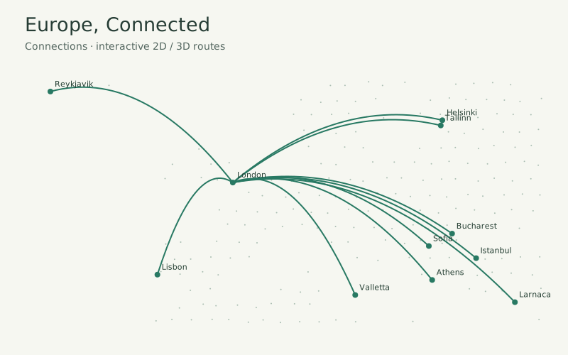
Choose London, Paris, or Vilnius and explore ten illustrative flight connections from each city.
Explore early prototypes. These experiments have their own controls and aren’t part of the map editor yet.
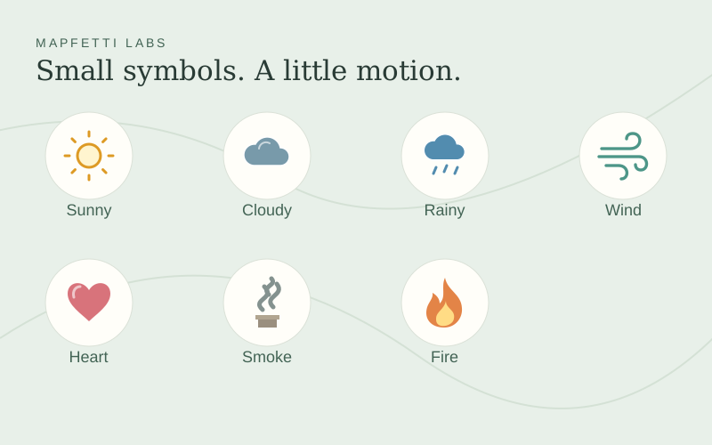
Give places a little movement with seven animated symbols. Try different colors, sizes, and speeds, or animate only on hover. Illustrative locations, not live weather or alerts.